
Best Dutch Book Designs 2021 - Catalogue & Jury report
As we speak, the jury of the Best Dutch Book Designs 2022 is already busy selecting this years 33 publications. Our very own Eleonoor Jap Sam, founder and publisher of Jap Sam Books is part of the 2022 professional jury! The nominations will be revealed soon, but before that happens we would like to share last years catalogues and jury report. Two of our titles have been selected for the Best Dutch Book Designs 2021. Rollable Ramblings. Koen Taselaar has not only been chosen by the professional jury, but by the student jury as well. Repairing Earthquake project 2011-2021 by Nishiko has been selected by the student jury.
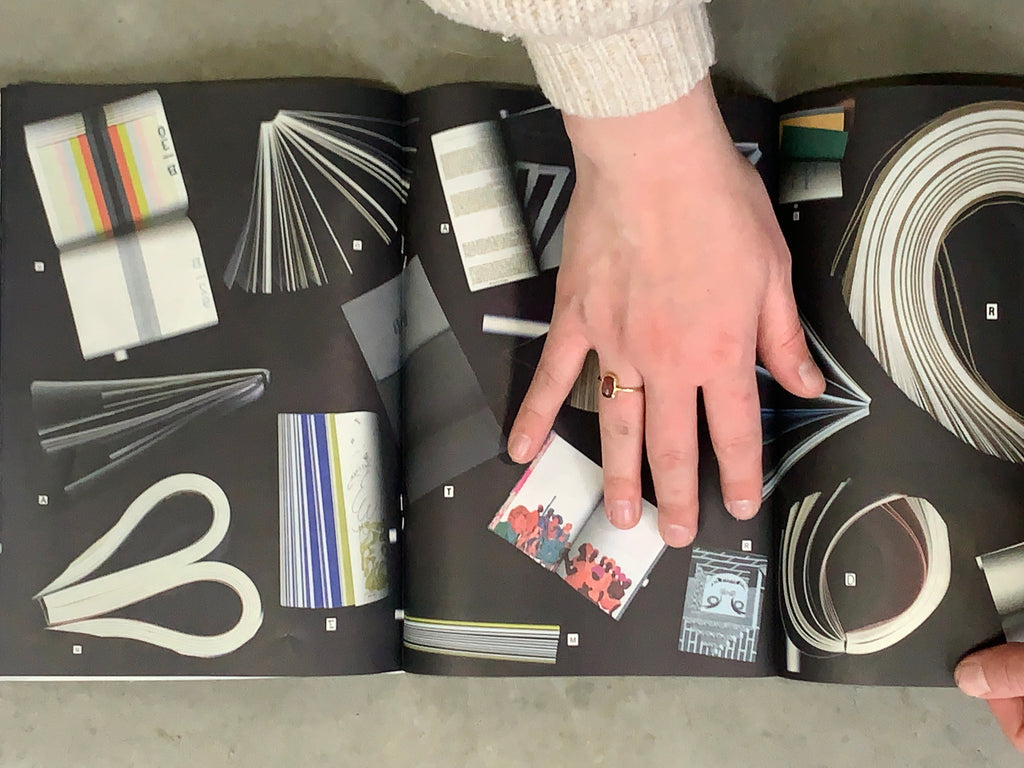
PutGootink was invited to design last years catalogue. The catalogue shows photocopies of the cover of each selected book along with 5 pages with a page from one of the other books. This allows the books to enter into a dialogue with one another, and puts emphasis on recurring motifs. The cover, pages, and jury report of each book are all separated into their own categories. Starting from one side of the book with the covers and when flipped starting with the pages, when met in the middle the jury reports can be found. The black-and-white representation of the books makes it possible for the 33 very different books to communicate with one another as equals in a new context, as these monochromatic reproductions cannot be compared to the original publications. The design shows the essence of the design of each publication, with an invitation to discover the 33 selected books on their own.
The student catalogue is designed by Alice Vink, Einar Vidar Gudmundsonn, and Patrick Hutchinson. The design of the catalogue is inspired by the way the student jury interacted with the books during the selection. Bolting through over 300 books in as little as four days does not allow for much critical reading and comparing of content. Instead the jury judged the books on remarkabilities and immidiate impressions. Lifting up the book, smelling it, how does it open, how does it close? Bending, twisting, does the book allow twisting, and so on. Just like the catalogue of the professional jury photocopies are used. This time in a playful way showing the exploration of the tactility of the books. In the imagery showing overviews of the publications in the student catalogue, the same flow of movement can be found as in the photocopies.
Below you can read the full jury reports of Rollable Ramblings. Koen Taselaar and Repairing Earthquake Project 2011-2021.


Rollable Ramblings. Koen Taselaar
Jury report
"From the very first page, this lovely, rich book which the jury selected unanimously draws us completely into the colourful tapestries by artist Koen Taselaar. The large format of the book is a good choice, which allows us to dive into the works at almost life size and study the many details up close and personal. Unlike other books seen by the jury, this is a good example of how the folded pages that accompany the Japanese binding have been used in a highly effective manner. The thinner soft paper used for the text pages is a little transparent, allowing the patterns printed on the insides to shine through the text. On the glossy photo pages that display the work, the patterns continue over the fold onto the next page and everything links up, as in a woven tapestry. The typography at times is a little shaky, but this is not entirely out of place in relation to the work. The text has been set inside blocks and a pattern in the weaves created, at times closed and at others more open.
The thick, black paper cover with white screen printing did sew some doubts; this felt more like a Team Thursday statement than about Taselaar. On the other hand, the tactile quality provided by the screen-printing was very well received. in addition, the monochrome exterior provides a very nice contrast with the interior, where the colour really leaps off the pages."
- Sarah van Binsbergen (art journalist & critic, jury member)


Student jury report
"'Rollable Ramblings' stands out both with its visuals and the treatment of typography. The publication is a comprehensive collection of Koen Taselaar's tapestries, complemented with essays on textile art. There is a loud, shrill energy in how the images are treated. The works appear in close-ups of details and ornaments,ents, revealing psychedelic scenes. Printed on glossy paper, the tapestries almost become a new image that gives the book a bold, funky character. The vibrant imagery contrasts with the soft white pages of the essays. The typography is one of the most experimental of the selection. There is no complying with the established rules of typesetting---type is almost forced into creating perfect blocks. Text is treated as a visual on its own, referring graphically back to the art of textile. The underlying system confuses but simultaneously brings even more energy to the spreads, shaking up the colorful flow with the edgy structure of the grey text blocks. A different, catchy, and exciting book."
- Polina Slavova (ArtEZ University of the Arts, Arnhem, student jury member)

Order Rollable Ramblings. Koen Taselaar
Repairing Earthquake Project 2011-2021
Student jury report
"'Repairing Earthquake Project' is a book of dedication and craftsmanship. Nicely varied content finds its main part in visual storytelling, collecting images of the Great Eastern Japan Earthquake. Wrapped into the story comes a personal commitment to preservation; in the momentous task of fixing and repairing the remains of a natural catastrophe, the well-organized content provides a look into the dedication and precision and care of one. Together with the general history comes an archive of personal work from within, meticulously fixing and repairing the broken. The clear and concise documentation speaks of the dedication and organization behind this task. Delivered in a simple design, paper choices divide the content of the book; the story told through the extensive image collection is irregularly interrupted by English Japanese text content. The book ends with several pages of archival sheets, displaying the work done in a collection of care and spirit."
- Patrick Hutchinson (KABK, The Hague, student jury member)


-
Jap Sam Books
